


10 Examples of 404 Pages You Actually Want to Find + Make Your Own
Last update: 30 July 2024 at 11:36 am
 5.00/5
If you spend a lot of time online, you’ve likely encountered at least one 404 page. You might even have come across a few custom error pages. Have you ever wondered why a business would invest valuable time designing a creative message for its visitors?
A standard 404 error page has little to say and often leaves visitors feeling lost. Worse, it can actively drive users away.
Having a custom page might not win your business any design awards, but it shows that you care about your visitors and their experience on your website. It’s also an innovative way to show them your brand’s personality.
Is it worth it to invest in a great looking 404 page? Absolutely, yes.
What is a 404 Error?
Essentially, a 404 error occurs when the requested page or URL is unavailable or, in some cases, doesn’t exist. While the message on the standard landing page informs visitors about the problem, they rarely provide any additional information or encourage users to remain.
Experiencing 404 errors can cause several significant issues, and they can occur on any website, well-maintained ones.
For example, Google regularly sends bots to crawl and catalogue web pages. If the search engine encounters these issues, it determines that your site offers a poor user experience. It’ll also affect your SEO, website traffic and search rankings.
In a perfect world, site visitors would never encounter a 404 error page. However, you can create a custom web page that users can enjoy and find useful. When you use smart graphics, relevant links, and witty copy, it can make users forget that something went wrong and get them back to browsing.
Many web development agencies can help you either avoid 404 error pages or come up with a design for a unique one.
How do Visitors Encounter 404 Errors?
Unfortunately, there are several reasons why a user might encounter a 404 error. The most common causes include:
- The page no longer exists.
- The user typed the URL wrong.
- There is a broken link on the site.
- The page moved and wasn’t redirected.
- The server might be down.
In short, whenever users try to visit a URL that can’t be found, they’ll be sent to your website’s 404 page. It can be a frustrating experience, and it can cost you valuable conversions. Luckily, you can turn a negative impression into a positive one with a well-designed original 404 page and a creative error message.
10 Examples of Brilliantly Creative 404 Pages
Creating a user-friendly, visually appealing 404 page shows visitors that you care about their experience and are interested in keeping them on your site.
When done well, a brilliant 404 page will encourage users to forgive you for the error or help them realise that they typed in the wrong URL.
A well-designed 404 page can make visitors smile and, more importantly, help them find what they’re looking for. Of the millions on the web, we found the best 404 pages that show off various brands’ creativity and personality.
Here are ten examples of innovative 404 pages that are done exceptionally well.
Screaming Frog
Ironically, Screaming Frog is a service that helps site owners find and fix broken links. They acknowledge having a 404 page by poking a bit of fun at themselves and then offering quick access to their contact page, services, and blog.
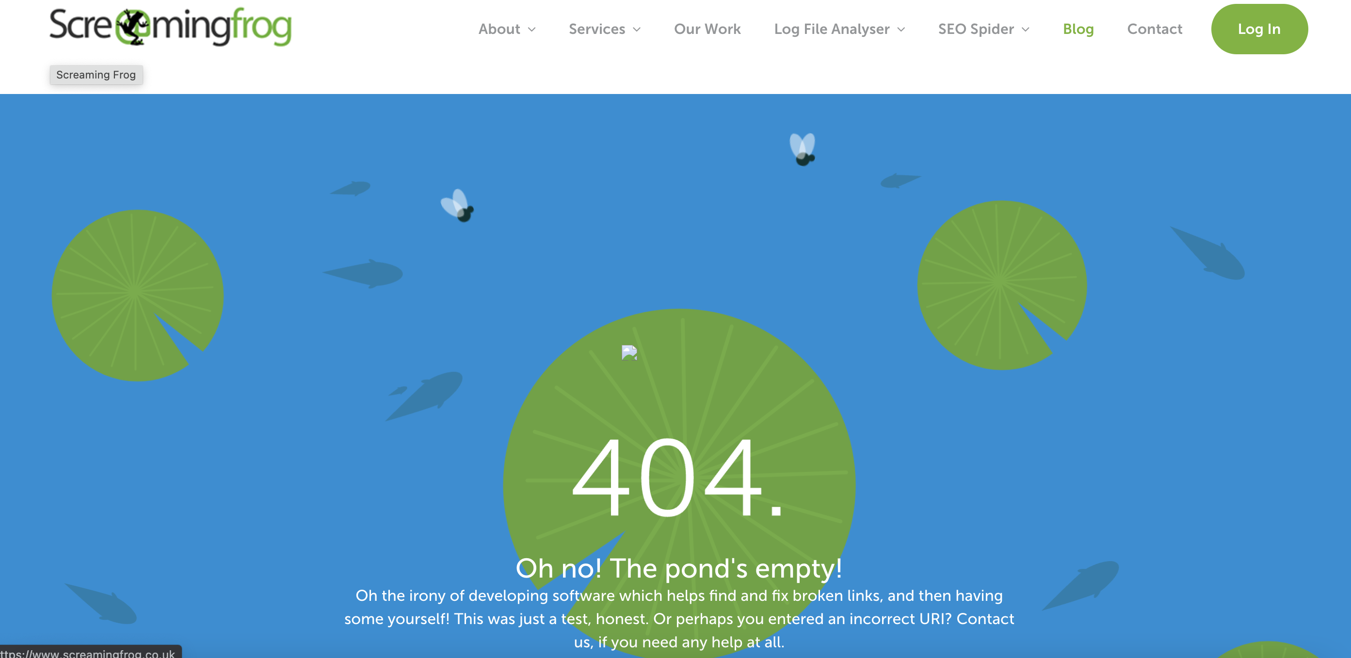
Screaming Frog’s 404 page is animated, and looks like a small pond viewed from above. The fish float, the lily pads spin, and the flies move around the page. However, the titular frog is missing. It might be a minor change, but it leaves a significant impression.
ConvertKit
Most people love dogs, and ConvertKit shamelessly takes advantage of our bond with these furry companions.
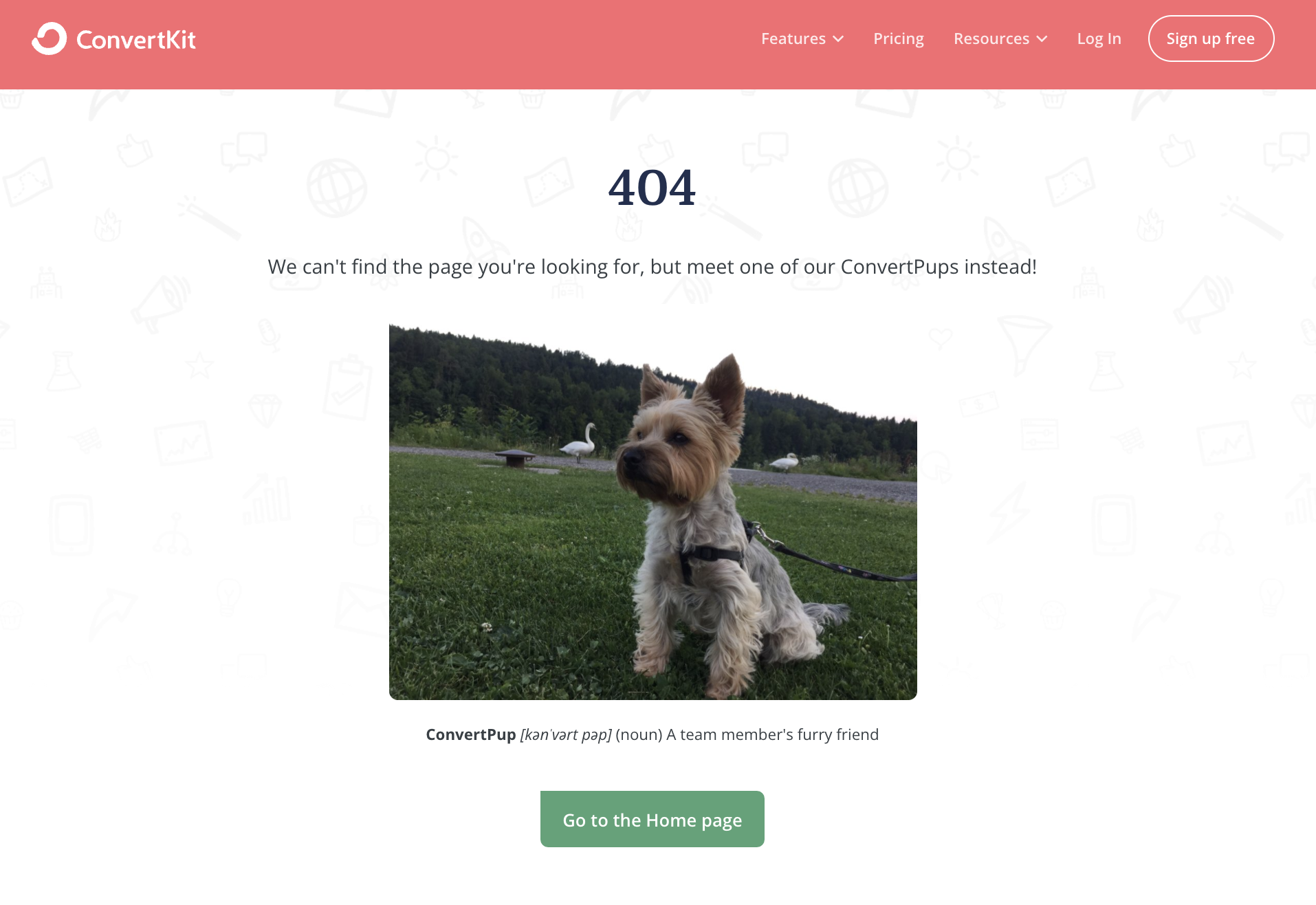
The page will show an adorable photo of a team member’s pooch. If you can tear yourself away from the cuteness, you’ll find a link to the homepage and access to their online chat. The simplicity of the page is one of the features that make it so compelling.
Apartment Therapy
Apartment Therapy is a home décor website, and washi tape is a popular adhesive used in decorating and scrapbooking. The brand’s 404 page ingeniously combines these two elements by joking that not even washi can fix a broken link.
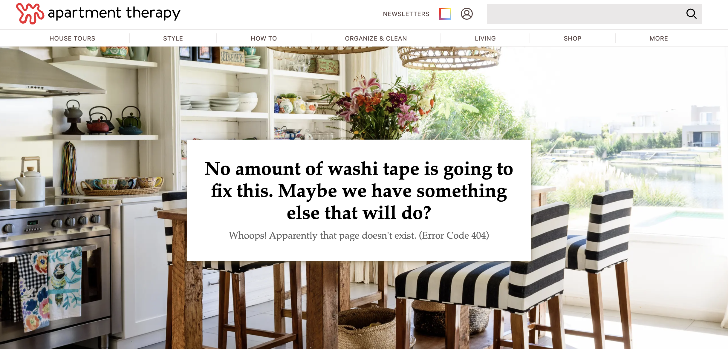
The page displays several popular posts just below the fold to keep visitors engaged. It also includes a search function and navigation bar so that users can continue to explore the website.
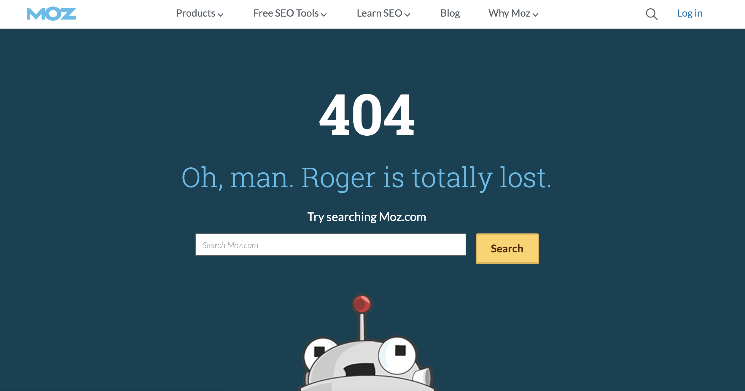
Moz
Moz keeps it relatively simple with a cameo form the brand’s mascot Roger Mozbat. Not only does it make most people smile, but it also on brand and matches the company’s personality perfectly. There’s also a visible search bar so people can find what they need.
CoSchedule
CoSchedule is a marketing scheduling tool. They keep things straightforward by displaying an adorable dog GIF while also providing links to their blog and homepage. The brand does a fantastic job by showing that you don’t need to spend big money to create an engaging and amusing 404 page.
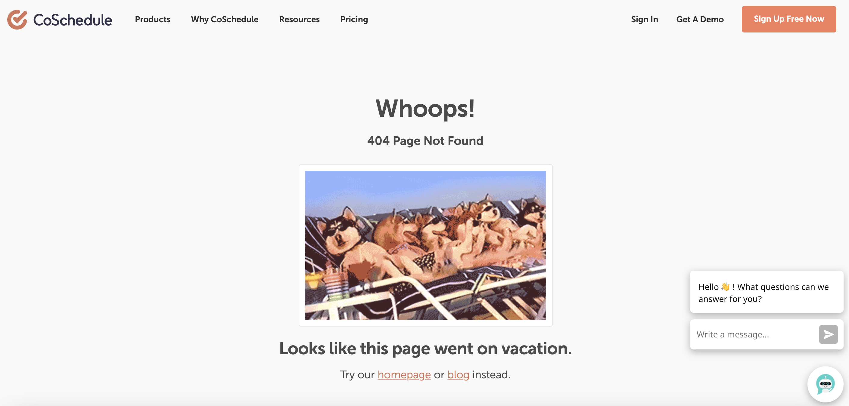
Simple and sweet but does the job!
Disney
Disney’s 404 page knocks it out of the park by highlighting one of the most popular characters known for destruction, Michael “Mike” Wazowski.
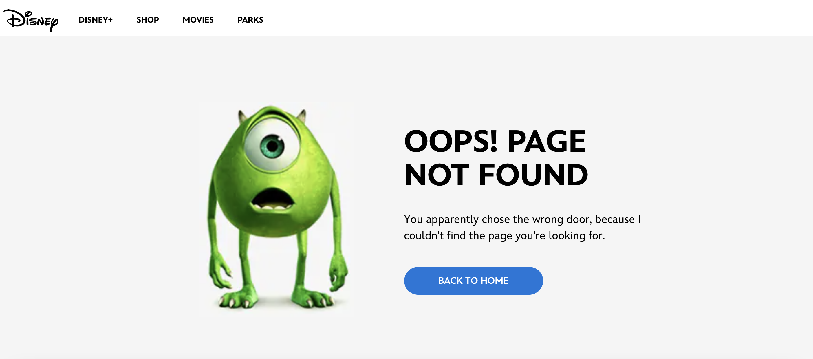
This characters is perfect for the 404 page. Interestingly, Disney’s error page that changes depending on the geographical location of the visitor.
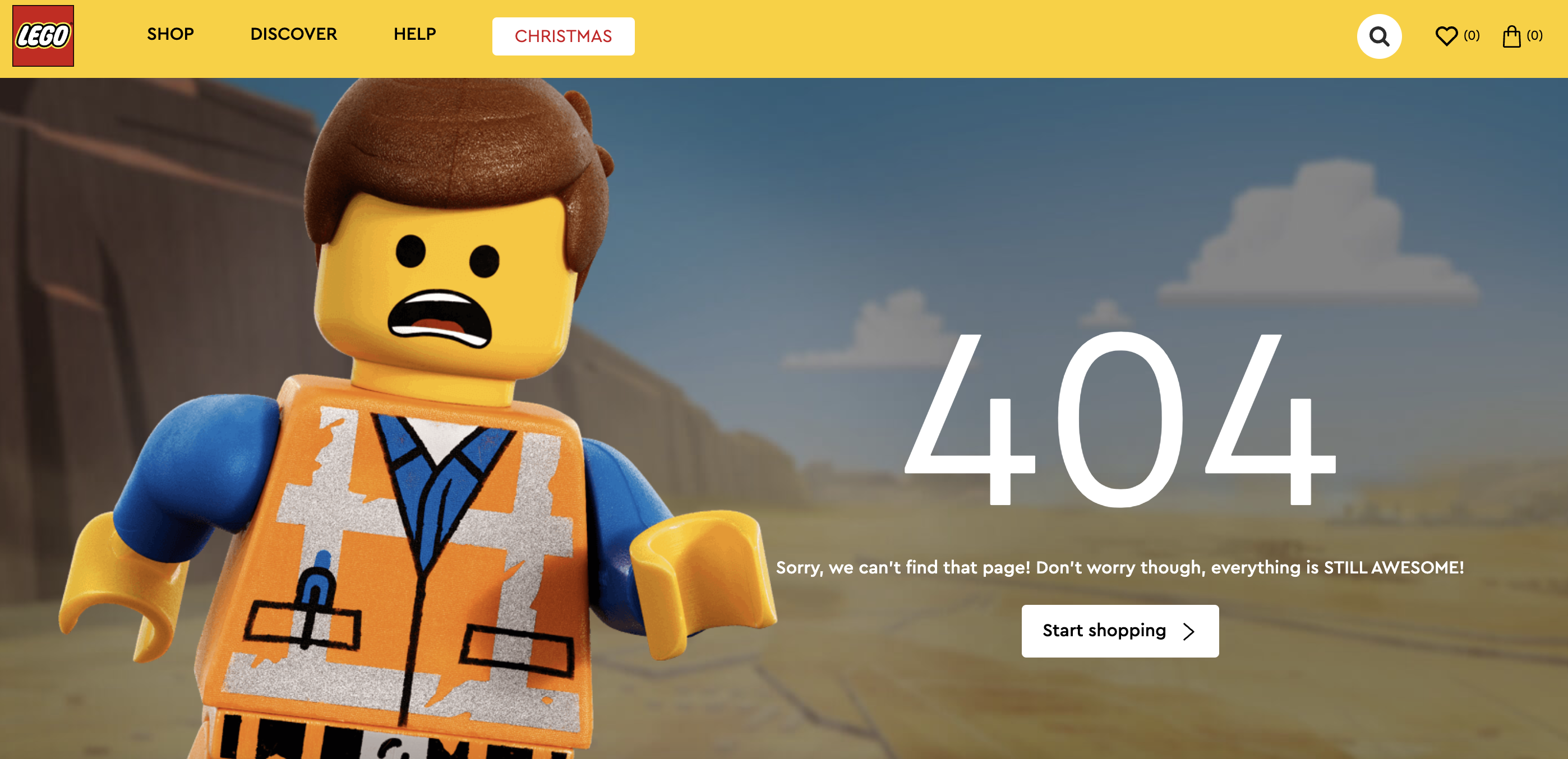
Lego
The Lego404 page is just what you’d expect; a sunny desert with a little Lego man that looks quite upset at the situation. Not only does it fit the brand perfectly, but it also encourages people to visit the shop. It’s a compelling call-to-action that works and doesn’t feel out of place on the fun, toy-inspired error page.
Sprout Social
Sprout Social is a social media marketing tool, and they really want to keep their customers on-page. First, the company makes a joke that pokes fun at their visitors being lost in cyberspace. While funny, what truly stands out is how the company uses the page to turn a problem into a lead.
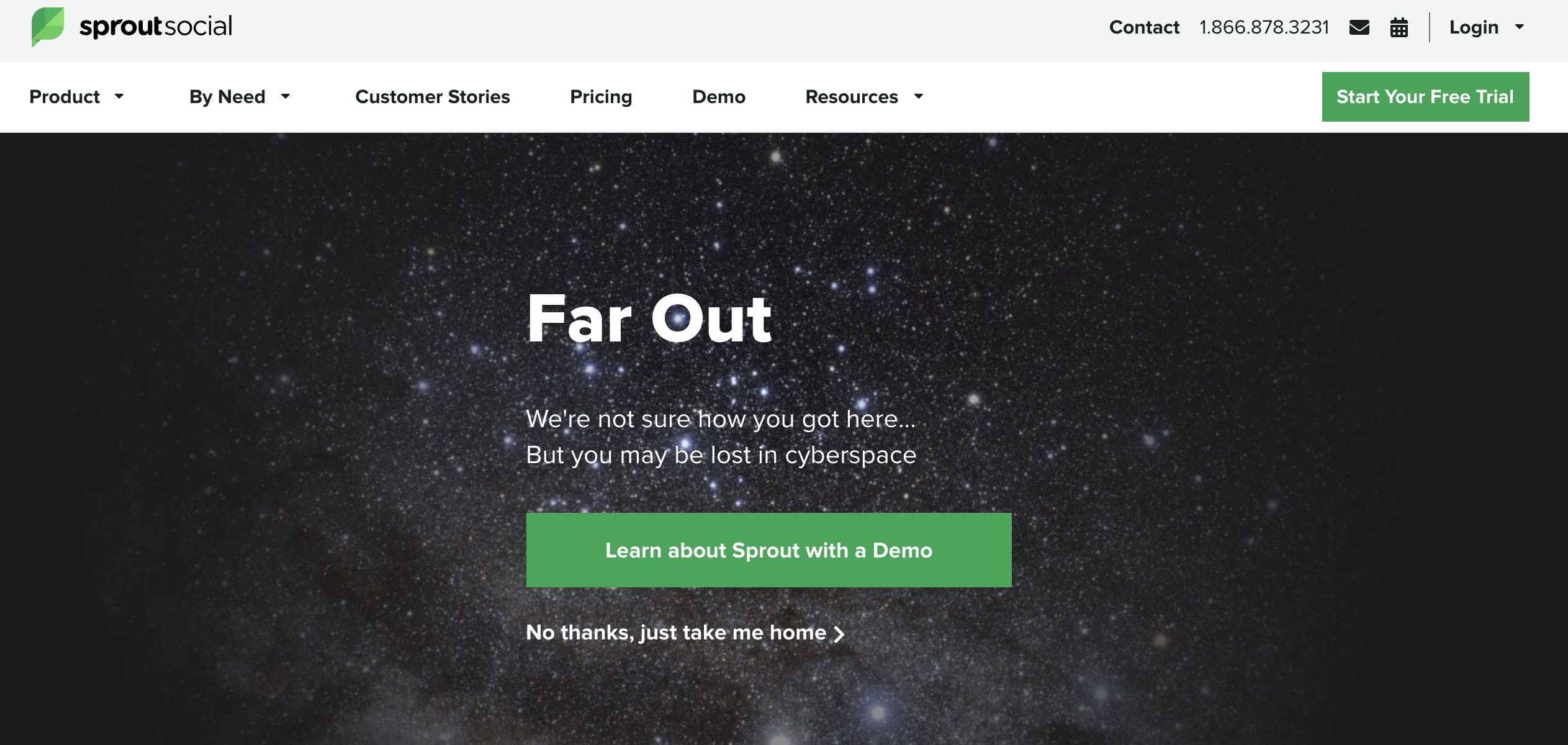
The brand’s 404 page is another excellent example of how you can turn an error into a conversation, with a CTA button that offers a free demo. If that’s not what you’re looking for, you can navigate away using the menu at the top of the screen.
In a brilliant move, Sprout Social turned their 404 page into a landing page.
Help Scout
Help Scout provide tools for help desk software, email-based customer support, and online knowledge bases to companies.
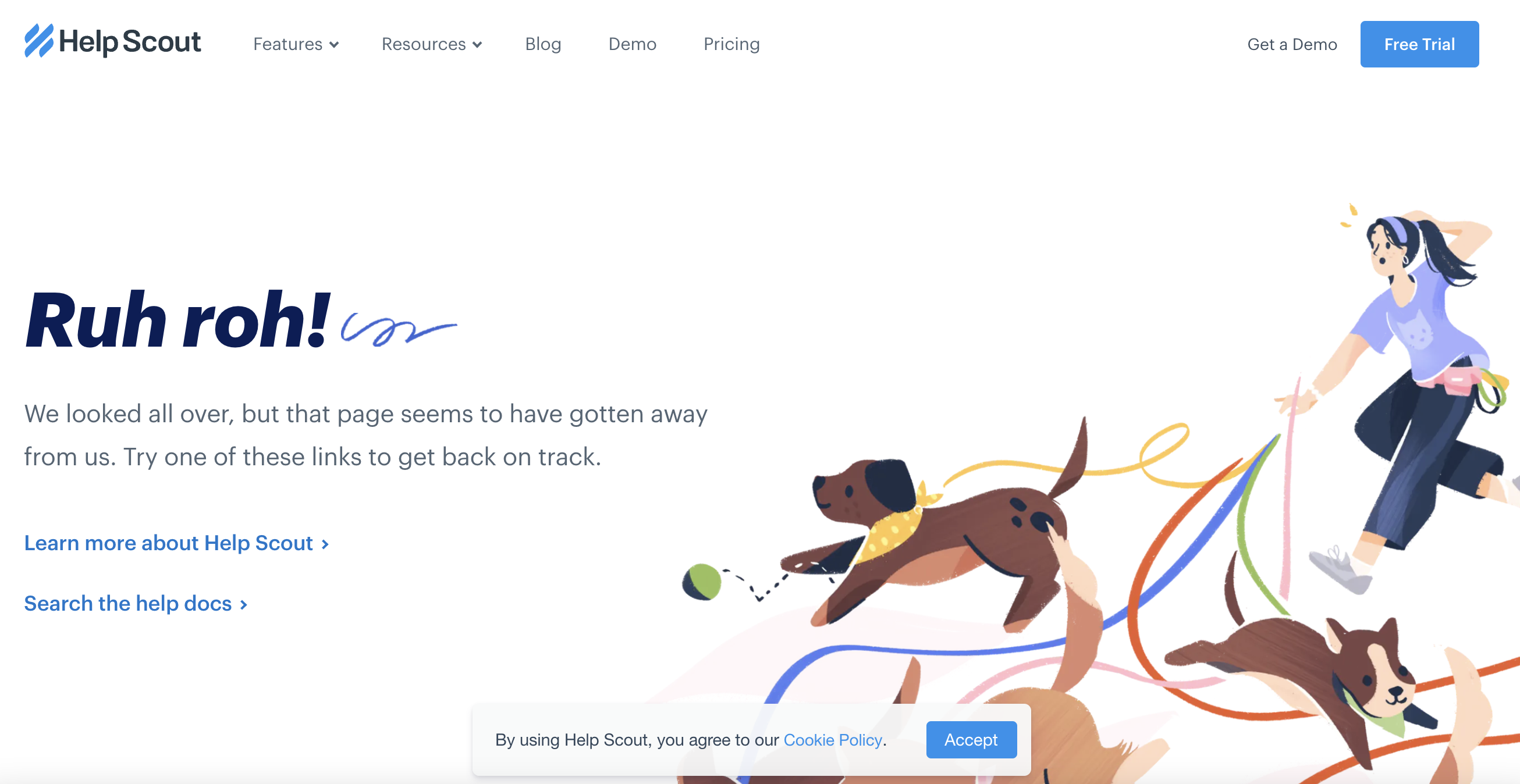
Again, like so many others, they take full advantage of the bond between humans and their furry companions. This time you get to empathise with the poor, frazzled dog walker as she tries to get a handle on the fleeing pooches.
BluePath
BluePath is a data and strategic analysis company that came up with a remarkable idea to showcase their skills on the 404 page. They also manage to poke a bit of fun at users without being offensive.
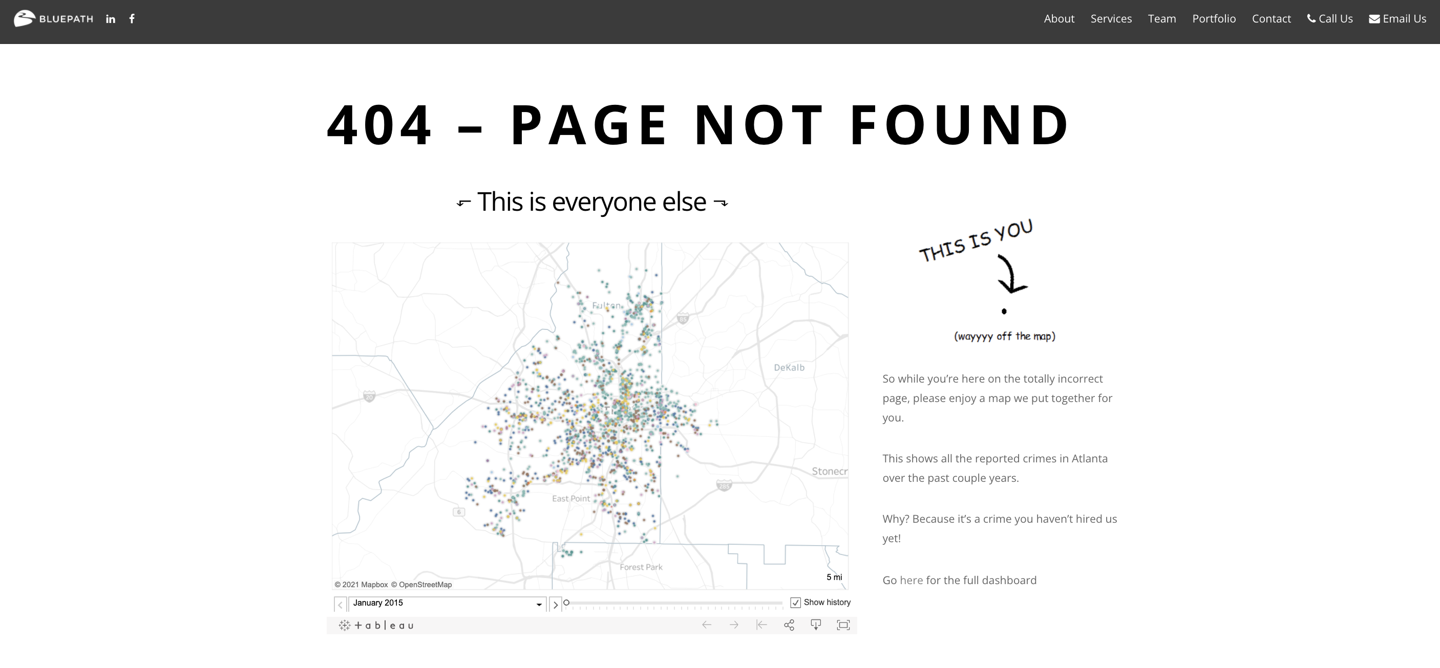
On the left half of the screen is a map showing several data points in Atlanta. Then there’s you; a small dot that’s way off the map. Why? According to BluePath, it’s because you’ve committed a crime by not hiring them for their superior data analytics skill.
The Benefits of a Custom 404 Page
If you have a large site with a wide variety of pages, there will likely be several dead links as well. It’s a common side effect that occurs as sites grow and page URLs change. With a custom-built 404 page, you can help visitors find their way to the information they want.
Creating a unique 404 page requires effort and a bit of technical knowledge. Unless you have an experienced designer available, you’ll need to learn how to edit your .htaccess file and run a few commands on your server. If you run on a CMS like WordPress, some plugins can simplify the process.
Even so, you may still be wondering why you need to put in the time required to design a custom 404 page. It’s a simple yet highly effective tool in your website’s arsenal if you know how to use it, and having one has several notable benefits.
Help Search Engines Index More Pages on Your Website
Search engines like Google often send crawlers to index new pages. Typically, an encounter with a 404 page hurts your SEO. However, you can design a 404 page that’ll increase your search engine optimisation instead.
By linking approximately 25 or more internal pages, you make it easier for these crawlers to index your site. Additionally, it’s possible to build a code that’ll randomise which links are shown. Consequently, the links will change every time the page is refreshed.
The process increases the number of pages that get indexed, making it easier for engines like Google to display your content in search results. According to SEO guru Neil Patel, the method can significantly boost your site’s search engine traffic.
Present a Consistent Brand Image
Your brand is one of your most important assets. It’s what draws people to your products and services, and builds customer loyalty. People want to feel that you share their values and that you care about their experience. They also want to develop an engaging relationship with your brand.
An original 404 page allows you to present visitors with a consistent message and appearance while showing off your brand personality. It’ll also reassure a visitor that they’re still on your site and not on a blocked server or a broken site.
Ultimately, your 404 error page should be branded similarly to the rest of your website, with the same colour scheme, fonts, logo, header, footer, and navigation. Using web development agencies in London can help you further optimise your page in line with your brand and best practices.
Turn a Lost Visitor into a Happy One
Pretend for a moment that you’ve arrived on a page while looking for information on a particular topic. However, after you open the link listed in the search engine results, you don’t get the answer you were searching for. Instead, you’re presented with the “page not found” error message.
Unfortunately, many sites don’t utilise this golden opportunity. Instead, they allow the angry visitors to leave with a dissatisfying experience. If you decide to use an original and optimised 404 page, you can prevent the loss of that possible conversion and instead turn a poor experience into a fun one.
Use the following tactics to improve your lost site visitors’ experience:
- Employ humour to defuse the situation
- Take the blame, even if the user might be to blame
- Provide a search bar so that they can look for information
- Include a link back to the homepage
- Suggest useful links that they might want to visit
- A way to contact someone who can assist
Not only will you defuse the situation and prevent the person from leaving, but you’ll also turn their negative experience into something less disruptive and more positive.
Increase Your Conversions
Your 404 error page should show site visitors that you not only accept your mistake but that you ensure that they have a delightful experience. The goal is to erase the broken or dead link’s memory and encourage them to do business with you.
Start using your 404 page to convert site visitors into customers.
When people land on your 404 page, offer them a discount or an exclusive opt-in offer. You can take it a step further and present them with customised link recommendations based on the keyword in the request URL. You can even provide an email or contact form so that they can contact for assistance.
How to Create an Original 404 Page that Works
If you’re going to create an original 404 page, you can follow a few steps to make it more effective. Most importantly, keep in mind that the most useful 404 pages are simple yet effective. Creating a complex and confusing web page will only frustrate your site visitors even further.
Below, we look at a few dos and don’ts for designing one of the best 404 pages for your site.
What You Should Include
For the past few years, eye-catching 404 error pages have become significantly more popular. They can provide visitors with useful links, a little fun and a reason to smile. There’s no reason for a 404 page to be the final stop for your any visitor to your site.
Here are a few handy tips to help you design an effective 404 page.
Strong Headline
It’s crucial to have a strong headline or text that explains to people why they’ve landed on the 404 page. When they arrive on a page that doesn’t have the information they wanted, a visitor can feel frustrated and leave immediately. Your headline should let them know that they’re in the correct place, despite encountering an error page.
Branding
Your 404 page should look the same as the rest of your web pages. Make sure that it’s easy to recognise your brand and take the opportunity to showcase its personality.
Explanation of the 404
When a visitor lands on a 404 page, explain to them why they’ve arrived there. Stating that the page “has been moved” or “no longer exists” can help visitors understand that a browser-based Pac-Man game hasn’t replaced the lovely yellow raincoat they expected to find.
Useful links
It’s your website, and you should know which pages or directories are the most popular. Include links to these pages or directories so that visitors experience minimal disruption.
A Search Bar
Including a search bar on your 404 page can help users find the information they want without having to hunt for the correct link or web page. By giving people the ability to search, you decrease the odds that they’ll summarily leave after encountering the error.
Call-to-Action
Having a call-to-action (CTA) is an excellent way to keep people on your web page. You can offer a discount, giveaway, or downloadable gift as an apology while receiving their data in return. It’s a simple and affordable way to turn an unhappy visitor into a potential lead.
What You Shouldn’t Do
There are good practices for designing creative 404 pages, and there are a few extremely poor ones. Below, we cover a few things you shouldn’t do when building your original 404 page.
Avoid Redirecting to an Error URL
It’s essential to ensure that your website displays the content of the error page and not redirecting the visitor to a different page like /404 or /error.html. Redirecting will prevent visitors from examining the problem URL and make it impossible to gather analytical data on the problematic link addresses.
Don’t Redirect to the Homepage
You might think that sending visitors to the home page is a clever solution, but search engines consider it “spammy” behaviour. In fact, some will treat the instance as a soft 404 regardless of the redirect.
Avoid Using a Meta Refresh Tag Redirect
Some websites use a meta refresh tag to send visitors to a different page else after seeing the 404 error for a few seconds. Forcefully redirecting a visitor to another page without their consent is considered terrible practice. It may also come across as misleading, and people would much rather leave than risk encountering malware or adware.
Final Word
An encounter with a 404 page doesn’t have to be a bad experience. In fact, it’s a great way to encourage people to further engage with you. Hopefully, you find yourself inspired after seeing some of the fantastic creations by others. If you’re getting ready to design your own original 404 page, remember to keep the following in mind:
- You should reassure users that they’re still in the right place.
- Don’t be afraid to take the blame for a broken or missing link.
- Get creative and build something memorable or funny.
- Be consistent with your branding in the design.
- Add useful information to the page.
- Don’t forget to include a call-to-action.
- Never use automatic redirects to force people to a different page.
Most importantly, have fun. There’s nothing wrong with poking fun at yourself, your brand, or your users. However, remember that there’s a line between harmless humour and becoming unprofessional or offensive.
Are you ready to turn your 404 page into a powerful asset?


