The Secrets to Sortlist’s Rebranding Process & Signs You Need One Too
 5.00/5
As September was coming to a close, we went through a rebranding process. It was months of hard work, back and forth. And with the new brand all we got was this new logo? A couple of new colours?
Nope.
Companies grow, and when they do, more often than not they change to meet the moment. Netflix used to rent DVDs, lest we forget. Rebranding is a complex process that not only changes how you look, but can change, on a fundamental level, how you behave. If the new brand identity is well internalised, it bleeds through in every decision every individual in the company makes.
It’s that powerful.
So more than a pretty new look, we wanted to dig in to the meaning of brand, what we learned and specifically what made it happen and why.
Rebranding Definition: What is a Brand, Anyway?
Why did we rebrand? Wait, what is rebranding? Back it up, perhaps it’s best to start from the beginning, what is branding and a brand identity?
Let’s do an excercise. Pick up a pen and paper and think of a company you know and love. What comes to mind? Note down the words that come to your head.
Those words, in a way, sum up their brand identity. At least from an external, personal perspective.
But brand is a two way street. It’s not just the way your company is perceived externally. It’s also the way the company perceives itself.
The brand is somewhere between a personality and a north star. And that’s why it can so easily be confused with things like colour schemes. While they represent the brand, they’re just that.
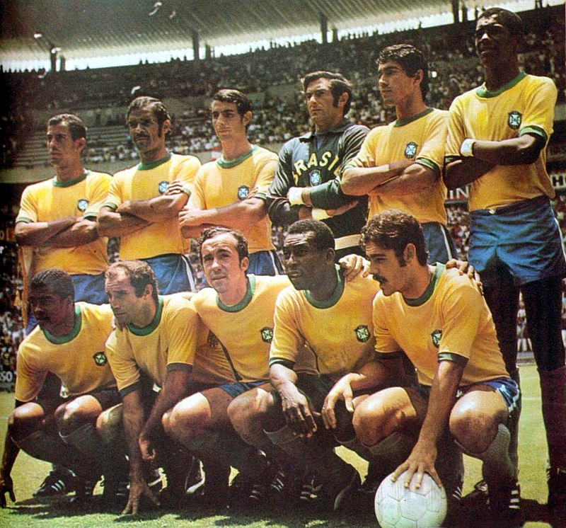
For the Brazil football team, the yellow shirt is part of their brand story. But their brand is not a yellow shirt. The brand is flair football, born on beaches of the very same colour. The brand is samba and alegria do futebol. All things that famous yellow shirt represents.
And the same is true for Sortlist.
The brand is not a logo design, the brand is not a colour scheme. Brand is not a product or a theme. Yet those are representations of the brand.
And getting it right can change everything.
The Telltale Sign Sortlist Needed to Rebrand
Companies evolve, and seven years ago, Sortlist was quite different. Netflix used to send DVDs – Sortlist used to be an algorithmically driven agency directory.
No longer: it’s transformed into a complete matchmaking service. And a fundraising round, with expansion into new markets was an inflection point in the life of Sortlist.
At the same time, Sortlist was moving towards a distinct moment. Moving towards a greater balance between AI and human matchmaking as, in 2020 the world locked down and human contact, paradoxically, became out of reach. And that human touch was part of a move towards transparency and a greater than ever level of information, on both sides.
Sortlist had evolved from the version you see below. So what we needed was a brand scientist, to take a look, and distill our new DNA.

5 Telltale Signs Your Company Should Rebrand, Too
- Does your company sit at the crux of a new moment?
- Has your company adapted its product to meet that moment?
- Have external factors put your offering into a new context?
- Have visual trends moved on since you updated your branding?
- Did you put minimal effort into your initial branding?
The S(h)ortlist
The advantage Sortlist has when searching for a partner to rebrand is clear. But the advantage turned out to be mutual.
Working in the same space, who better than a Sortlist member agency to understand not only Sortlist’s market and target audience (the outsourcing landscape) but Sortlist’s product (the matchmaking platform)
Who better than our own clients, our own branding agencies, for X-ray insight on a sector in mutation, Sortlist’s place as an intermediary and the value not just of Sortlist now, but Sortlist going forwards? In this case, there was no need for focus groups.
La Superboite, the agency that applied and won, did so through a powerful external perspective on Sortlist’s value proposition – leveraging just that.
“We seduced Nico with an observation on the sector in mutation and the relationship between data and the human.” he begins. “It shook Nico. We did that in 10 slides. We wanted to take a different approach, and Nico chose us because we were the only ones to challenge the initial idea.”
Benoit Berghmans
So, Sortlist’s Rebranding
“Branding is communication, and business arrives at a point in its evolution, where the visibility material, logo, tone of voice and graphic material needs to be reimagined”.
“With a rebranding process, there’s precedent. Many things have been done and you know where you want to go in the future. So a lot of the work is understanding both those sides of the coin.”
So far, so clear.
But there’s one point that Benoit mentions in our chat that perhaps gets to the heart of the issue:
With Sortlist, it was mission, values and ambitions that defined the rebranding. It was seven months of strategy, briefing documents, to understand who Sortlist was yesterday, who they want to be tomorrow. It was only two of graphic design.
The typography, the colours… they were the end point, to illustrate the strategy.
The Rebranding Process: Brand Strategy in Action
Rebranding ismore strategy than design. And the focus outlined above only underscores the fundamental role of a long experience in our sector, and with Sortlist’s product.
It seems time well invested. A 7:2 strategy-design ratio hits the nail on the head.
Because for all the impact of a beautiful new logo, slick colour scheme and clever visual details (did you notice the speech bubble between the R and the T of the logo?) – the work put in on the strategy will have more than double its impact.

80% of the Work: Brand Identity
So where did all that time spent on rebranding strategy go? On providing the north star to guide our day-to-day. On building a clear foundation: the convenience of digital, but the desire for human contact. A fragmented market and harmonious solution. This foundation was key to the building of the brand above.
Let’s be clear. Strategy is the place branding (or rebranding) can have the biggest impact.
The visual has its impact externally, and is important without doubt. But don’t be seduced by shiny things. It’s the strategy that impacts the team and focuses every hour of every day.
So, what was it that makes Sortlist relevant? What is the moment we’re looking to meet? The team took the time to locate Sortlist in the market and distill its value proposition, now and going forward.
At Sortlist there are as many human matchmakers speaking to, meeting with, and connecting companies and partners as any other role in the company.
And outside of Sortlist, digital has made talent the only differentiator. “Traditional agency” is an anachronism. Small and medium sized operators are more agile, their size helping them fill the gaps left by the big agencies. The only thing lacking is the opportunity brought on by trust…


Sortlist’s Brand Story (and how you can find yours)
There are a few steps to distilling your beliefs into concrete brand values. And getting these beliefs down on paper is a fundamental part of creating that brand mission. Here’s what we took into account:
- Talk to your founders. Maybe you are one. Think back to the early days of the business and the gap you looked to fill. Make sure your beliefs relate.
- Ignore your business plan. Ignore your projects. These change. Choose evergreen beliefs.
- Think: is it a fundamental truth? Was it true in the past, but we just didn’t see it? Will it be true in ten years?
- Keep it to five at most – too many beliefs aren’t actionable, and can’t be integrated into a day-to-day.
Your beliefs drive your action. And your action influences those beliefs of others. Which in turn drives their action and other beliefs.
Suddenly those brand values have created that most intangible but powerful of things – what all businesses grope for. You’ve created a culture.


How To Distil it Down
Now was the time to think, a question you can put to yourself: “Can you, or anyone at your company, sum up your brand in just some bullet points? If not, work backwards and clarify those beliefs. For us it was:
- Human first
- Local first
- Aided by digital
- Harmony from fragmentation
- A meeting can change the world
What You Can See: From Brand Strategy to Brand Action
Time for that other 20%. From these beliefs, from this conceptualisation and “brain work” start to come tangible results. The visual identity – a new logo, new colours, new elements. The face to match a new body.
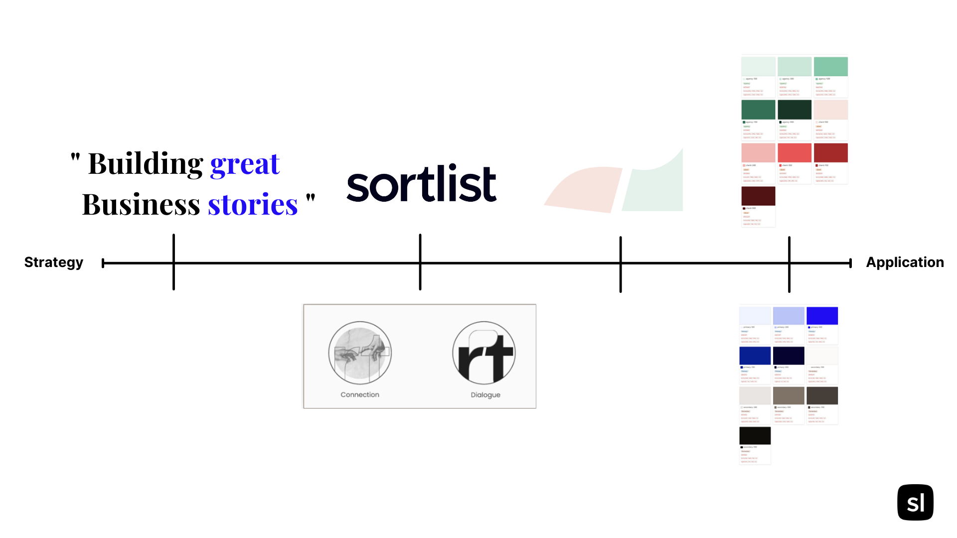
The Tagline: Building Great Business Stories

This was perhaps the most striking for us. Encapsulating the human touch, the fact that a meeting can change the world, and the idea of better partners making better business – “Building Great Business Stories” is very much the Sortlist north star, day to day.
This was the first element, the cornerstone of all the rebranding work that came afterwards. It’s hard to underestimate just how distilling it down, can bring focus.
Whole, it encapsulates what we do. And read vertically:

It encapsulates growth (building business) and humans (great stories)
Permit me just one more comparison.
At the risk of committing the tech start-up cardinal sin (never compare yourself to Apple) – there were once two little words from Apple (Think Different) that came out of a 1997 rebranding process to form the company’s DNA.
It was a company in trouble in 1997. But that mentality of the new brand identity, embodied the company’s mission, and infused everything from marketing materials to T.V. ads to daily decision making.
“Thinking Different” led to the harlequin iMac, the iPod and the iPhone – and it led to Apple changing… (cliché alert) the world.
“Building Great Business Stories” does the same for Sortlist.
It infuses, in our day-to-day, the ideals of connection. Of human warmth, of growth, of course. But also of ambition and of dreaming that’s on both sides of the project. The dreaming of the agency, and the dreaming of the story that you’ll write with your new project complete.
Benoit says the same:
“The cornerstone was the transformation of the brand from practical to inspirational. a common belief on which to build the message: a real match, a real direction”
A Tagline Tip
Starting with a tagline was a great strength of our rebranding. Why? Because it gave everything that came afterwards a focal point. It informed later design and distilled, further still, those beliefs into something actionable.
It’s always a risk that you put in that strategy work then pat yourself on the back and roundly ignore it as you create entirely separate logos and shapes.
The tagline is digestible, with every action (in the company and in the rebranding!) you can ask: does this represent building great business stories?
A New Logo
“We didn’t add the speech bubble within the logo, but the idea will always be there and it is implied.” says Benoit. “Many companies have the outline of a shape in their logo. Take Fedex”.
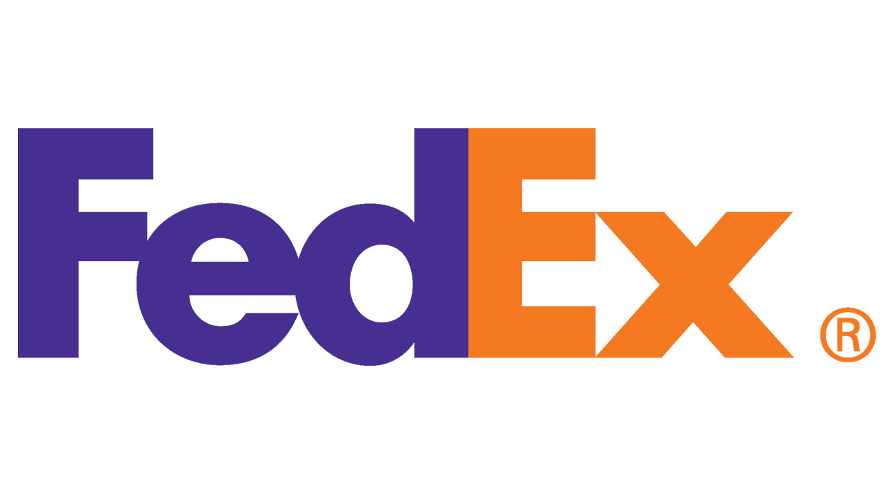
It’s a subtle touch that says a lot about the attention to detail that has gone into the visual elements of this new branding.
“The font is about meeting, and we incorporated the speech bubble to show the connection between two humans”.
To make that happen, a custom font was created and implemented to enable that speech bubble to pop clearly. It creates an element at once clean, confident and accurate (like “data”) but always with the human touch behind.
“And we got rid of the dual-tone and went to 100% black to show confidence. Like someone in a pair of black shoes, that’s stability, sensible, in it for the long haul.”
As the first introduction to Sortlist – much is said here with very little. Well, four words to be precise
Building great business stories.
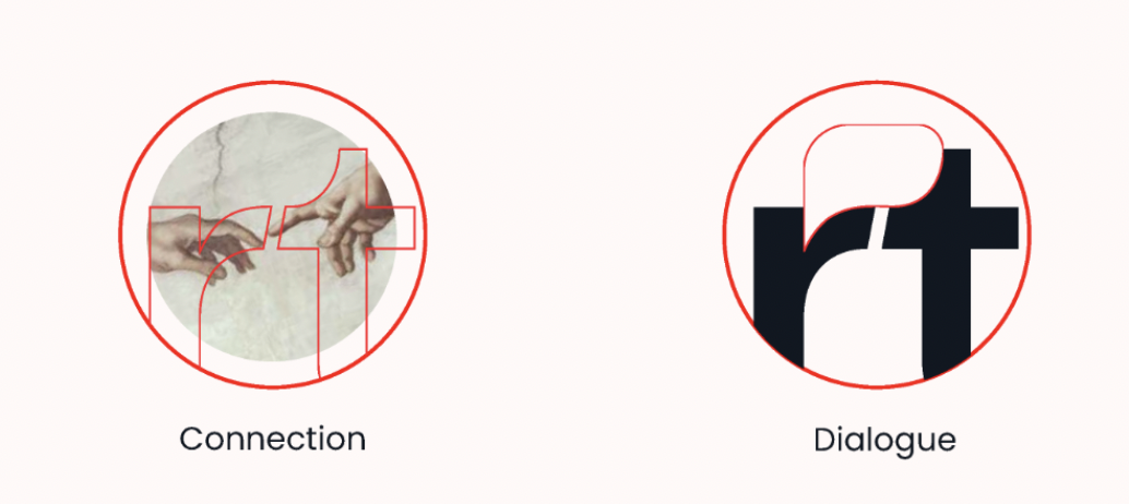
Deeper into connection – The “Shape”
Nike has the swoosh. So does British Airways. McDonalds has the golden arches. Although it was decided that an icon itself was unnecessary, a “shape” to represent the spirit of Sortlist was created.

Zoom in on the R and T, that moment of connection and dialogue, and our shape appears. But more than that: it’s a growth curve that, despite stagnating, takes off once more, in the moment of coming together.
Striking visual elements such as this, stem from, and validate, that strategy-first approach: It’s a neat way of encapsulating in two abstract shapes, “Building business”, “Great stories” and Sortlist in between.
The result is something distinctly, totally, representative of Sortlist.

Like the Nike swoosh that practically screams “speed” – this is an element that can be used in any amount of visual material – and in doing so makes a strong statement about who Sortlist is.
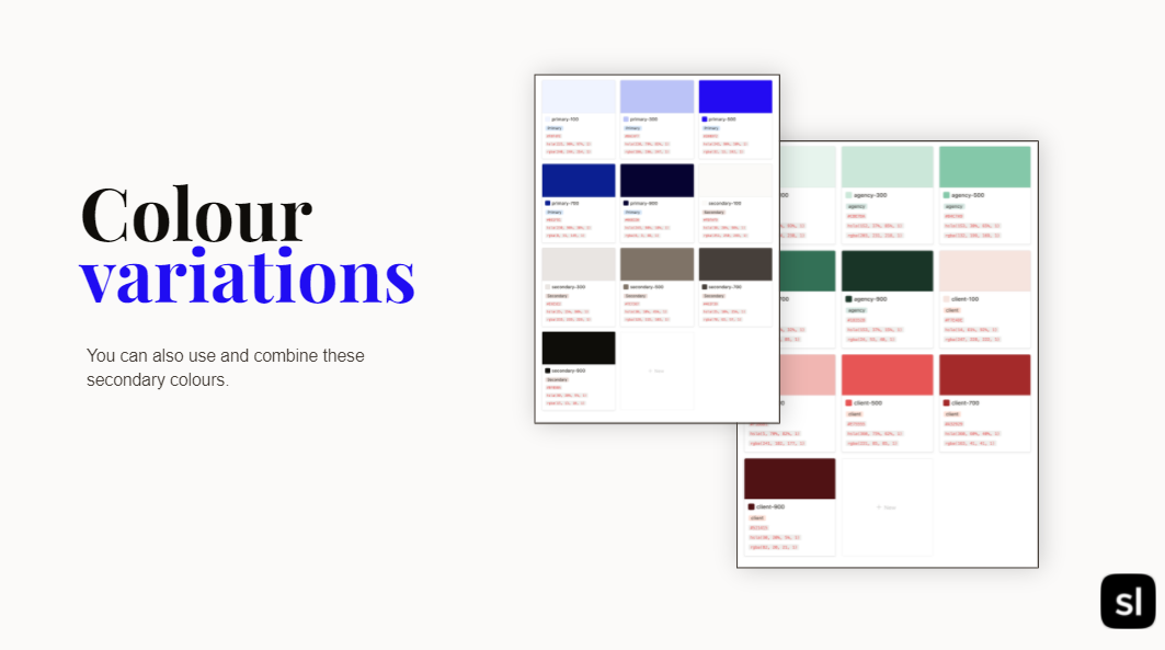
Can a Colour Have Personality?
The elephant in the room is, of course, that new colour scheme. It’s perhaps the element that strikes first.
But what’s in a colour?
Again, brand strategy was central.
Sortlist represented by the black and off-white – it’s the trusted partner, the “black shoes”, steady and reliable.
“The black is 100% black because we have nothing to hide” – Benoit
The client and partner meanwhile are warm, pastel colours, the kind of colours you could certainly imagine in your mother’s kitchen. That’s the human touch.
Benoit describes them as “Calm and human” and that’s true too: the sense of calm, following the client finding their perfect match almost radiates from the two.

More Than a Rebrand
So, why rebrand? What does it offer? What did we get and what did we learn? And was it a successful rebranding, in the end?
Our reason for being had changed, along with our product. The world around Sortlist had changed too putting that product in a whole new perspective.
The new look certainly speaks of a new start for the company.
But it’s far more than a facelift, hopefully that was made clear. And it’s not some major revolution in product, or a new vertical or anything so tangibly related to the day-to-day operation of the business.
Strategy is so crucial to a successful rebrand.
If you put all the elements of the rebranding on a timeline – the centrality of that strategy becomes more clear. Everything stems from the promise of great business stories, from the logo and its themes of connection and dialogue to the shape which stems from the logo.
A rebranding process should be considered a moment of reflection, a re-centering, rather than as an exercise in design alone. Ours was an analysis on where we are and what we do, here and now. A verification and confirmation of our character. Then the choosing, the careful designing of the clothes that fit that character, that convey who we are.
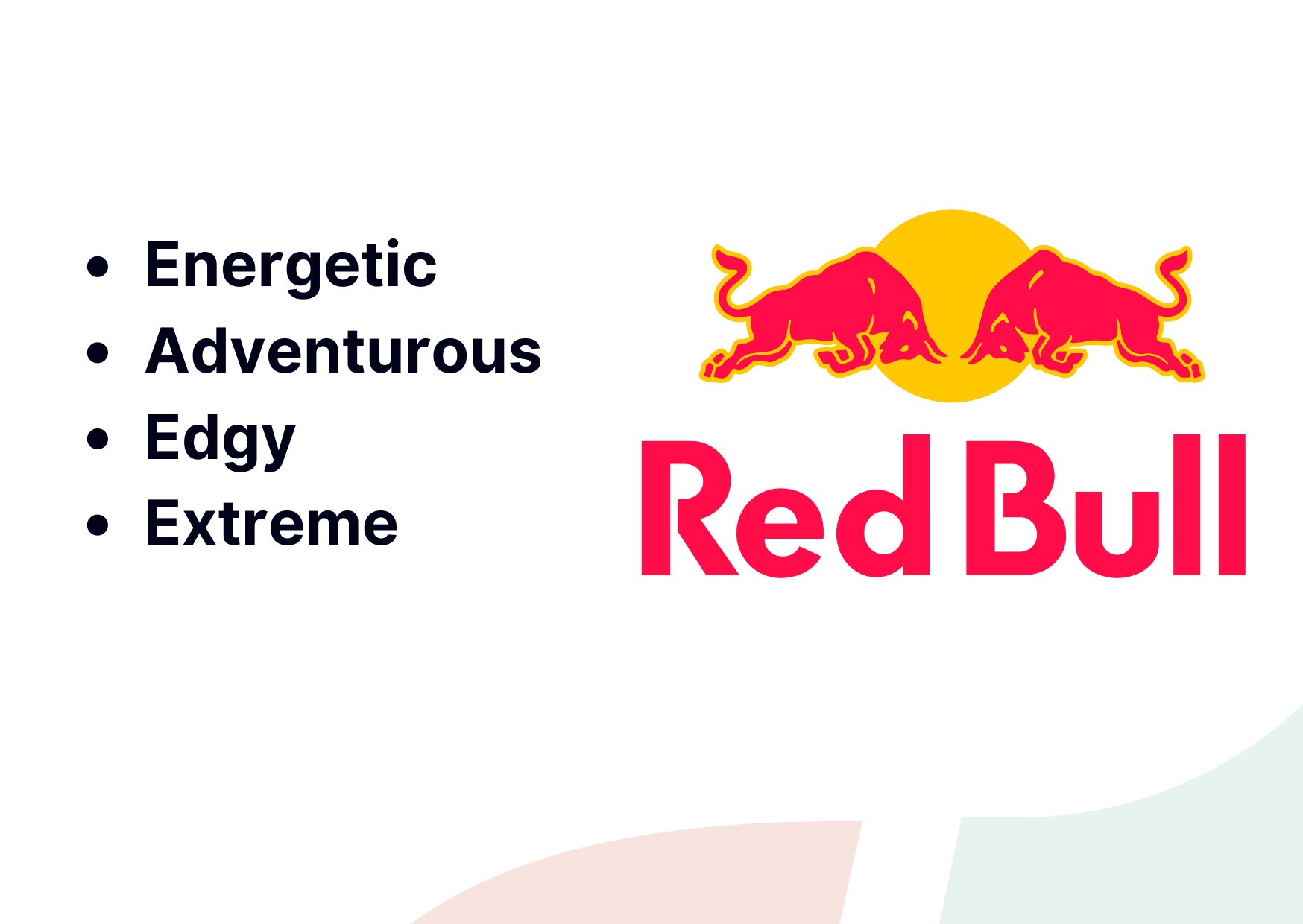
Like Red Bull wears a jumpsuit, to convey its adventurous side, perhaps Sortlist wears a business suit, a pastel coloured one. But it clutches a sheaf of papers, clears its throat, and prepares to tell your story.