The 12 Best Landing Page Examples for Conversions in 2024
Last update: 19 June 2024 at 03:21 pm
 5.00/5
We often hear that a web page can have an impact on the conversion rate.
But how do you create a landing page that converts?
In this article, we give you 12 landing page examples. These can inspire you to redesign your current site and improve your conversion rate.
Key Takeaways
- A landing page’s primary goal is to guide visitors to perform specific actions, like downloading an ebook or signing up for a service, by providing detailed information and a form to fill out.
- Unlike main website pages, landing pages are standalone and focused solely on converting visitors to leads or customers, ending their purpose when the marketing campaign concludes.
- Effective landing pages, as shown in 12 examples including Shopify, Airbnb, and Lyft, typically feature simple designs, concise texts, strong CTAs, and elements like testimonials or infographics to boost credibility and engagement.
- Tailoring the design, wording, and functionality of your landing page to your industry and audience, while adhering to best practices, can significantly improve conversion rates.
Understanding the Purpose of a Landing Page
Before we start with the examples, we need to be clear about the purpose of a landing page in a conversion process.
It is not a marketing space for your products or services. Nor is it the main page of your website. It is any page on your website where a visitor arrives after clicking on :
- A call-to-action button,
- or a link.
Perform a specific action
The main objective of having a landing page is to guide visitors to perform a specific action.
This can vary depending on the needs of your campaign.
Often, we see them designed to push prospects to :
- download an ebook,
- register for an event,
- participate in a promotion,
- sign up for a service or newsletter,
- buy a product,
- etc.
The sources of traffic for a landing page
The functioning of a landing page is very simple. The person sees an ad on social networks or on a website. When they click on this ad, they are redirected to your landing page. There they will find more detailed information about the product or service you are promoting and a form to fill out.
By filling in the fields, the person goes from being an anonymous visitor to a prospect. They receive what they signed up for. Their information is stored in your database for future promotions or marketing actions.
Difference between landing page and website
You have to take into account that in principle your landing page has no link to your website. It lives by itself and is designed exclusively for visitors to become subscribers or users. Its life ends when the marketing action ends.
In fact, it is essential that you have a landing page for every campaign you run. That is to say, if at any given moment you are promoting an ebook, an event, and a contest, you must have a landing page for each of them.
Do you need |
Discover the most relevant agencies for your project based on your own specific requirements.
Show me agencies12 Landing Page Examples
To help you in the process of inspiring and creating your landing pages, we’ve decided to share 12 examples of pages that convert and have a great design.
Shopify
The simplicity of the design, the short texts, and the direct description of the product is what we like most about this landing page.
The title manages to explain in just 4 words what the person who subscribes to Shopify will receive. The form only asks for one piece of information: email address.
And for those who need more information, information about the benefits of using Shopify can be found at the bottom of the landing page.

Airbnb
Airbnb, the global accommodation rental service, has managed to create a simple landing page. In addition, it is full of valuable information for those looking to organise a trip.
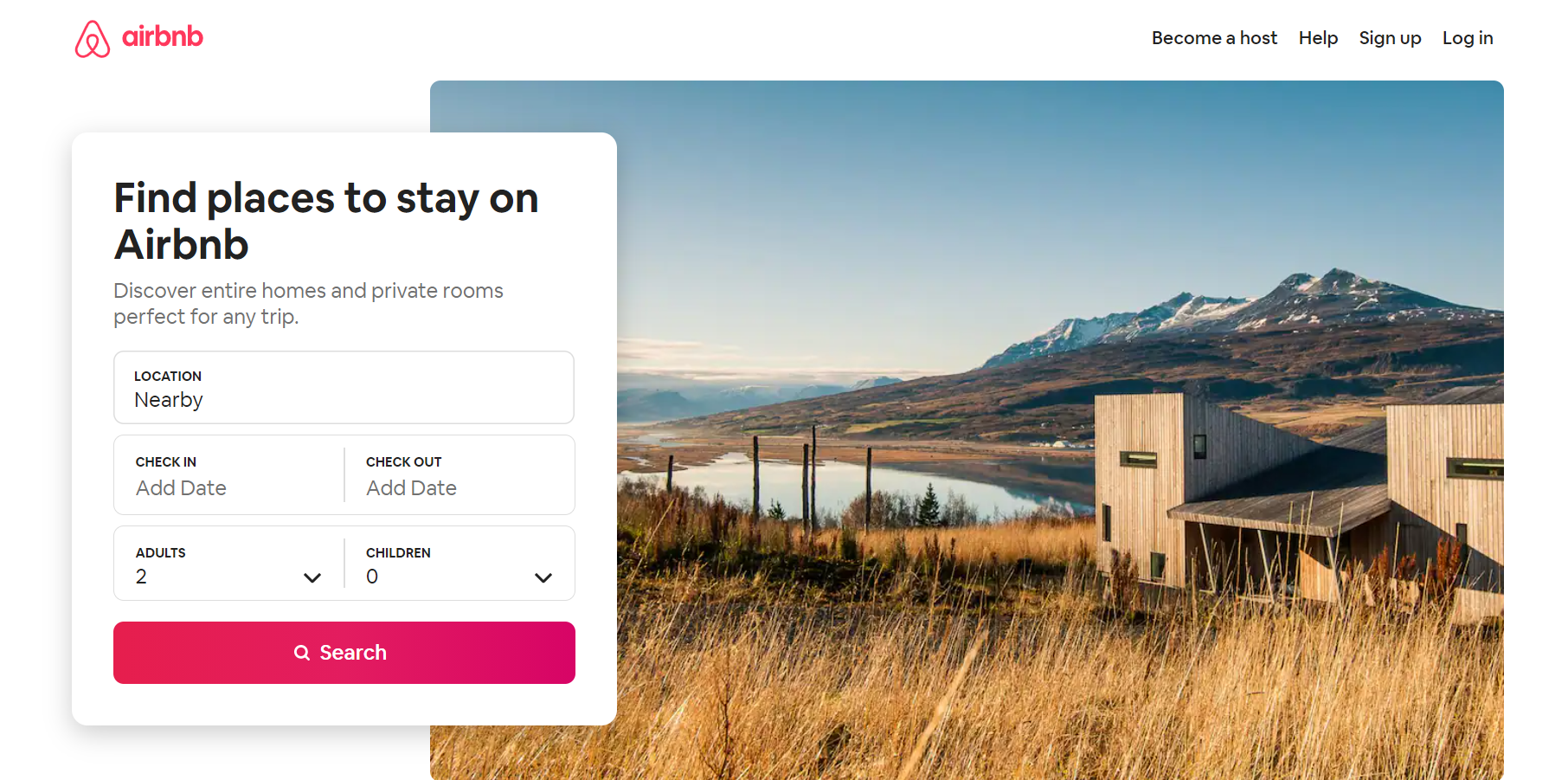
In the first visual, although it has a white background, the first thing that catches our attention is the photo of a landscape.
The form is designed to further personalise the results. And this without having to share data such as name or email. Further down, there are various testimonials and a list of the latest bookings made.
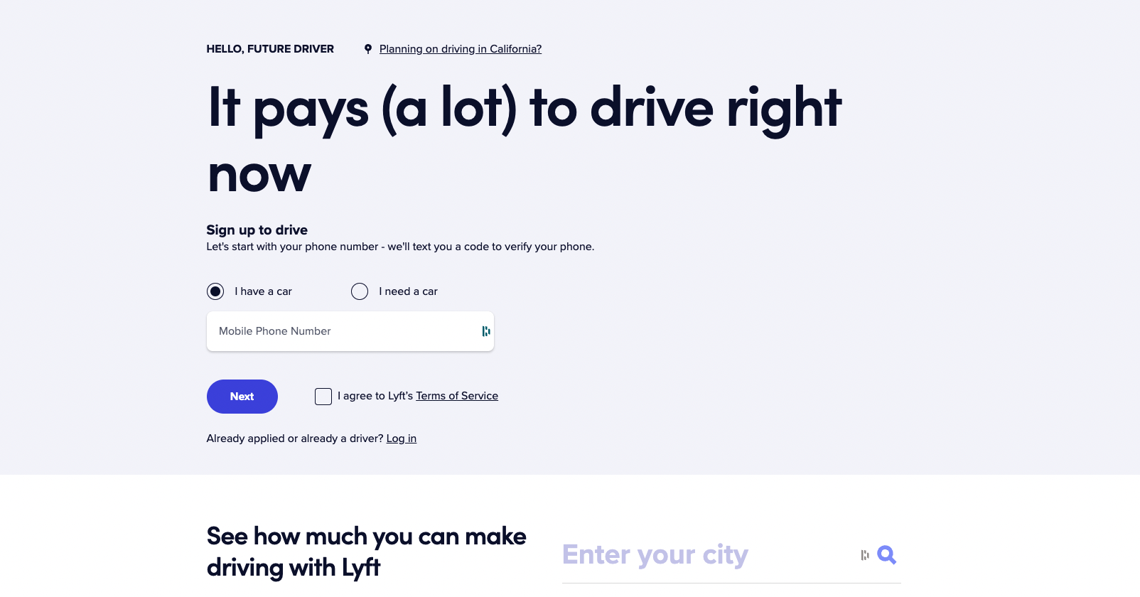
Lyft
No photos, no distractions. Just a colourful background, simple letters, and a headline that highlights the main benefit of working with Lyft.
This landing page manages to put into practice all the recommendations for improving conversion rates.
They take advantage of every inch to share valuable information for those considering this option over the competition.
They also include a small dynamic infographic. This one explains step-by-step how to work with Lyft. There’s also a section that briefly and accurately answers the most frequently asked questions.
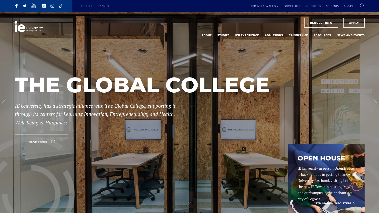
IE University
The Spanish university is not far behind. In this example, we see a perfectly good title, a CTA to attend the next open house, and a carousel of useful primary information about them.
And even further down, they detail in a graphic the main reasons why their offering is the best on the market.
There are also written testimonials with photos and current positions from former students. The call to action is consistent throughout the landing page and invites the reader to request more information and attend upcoming events.
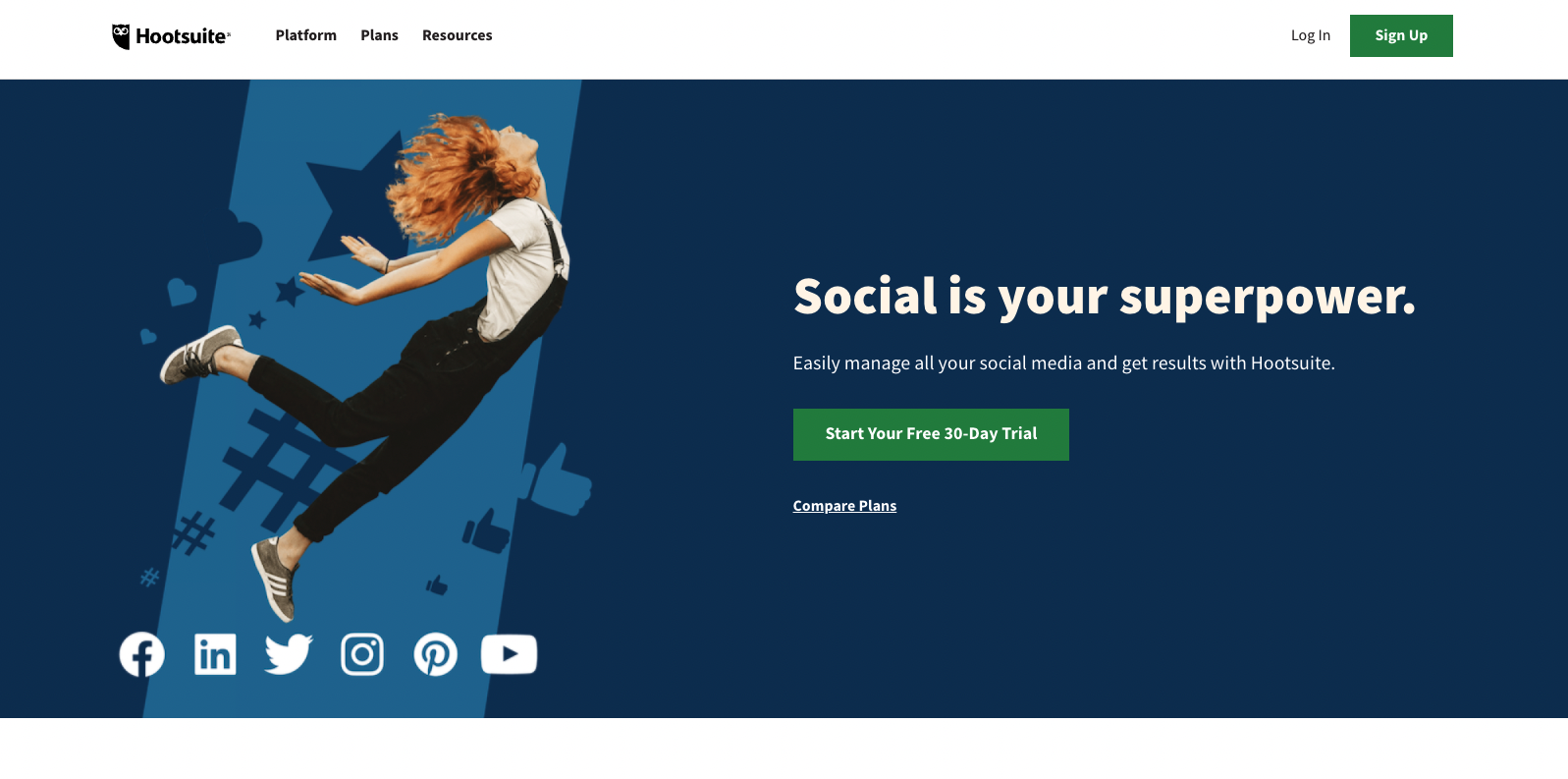
Hootsuite
Both the headline and the accompanying text and call to action are precise. In just a few words, the brand manages to explain the next steps the visitor should take and what they will get when they complete them.
It also includes an infographic that highlights the multiple benefits of starting to work with Hootsuite.
And they top it off with a series of logos from major companies around the world that are already customers of Hootsuite, reinforcing the message that their platform is the best for managing your social networks.
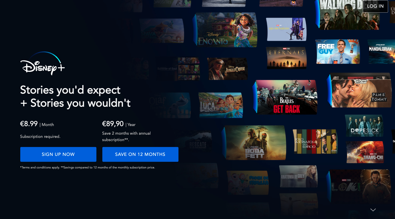
Disney+
An example of a simple landing page that gives you a perfect understanding of what you would get if you signed up for the subscription they are promoting.
Unlike the other examples we’ve seen, Disney uses a background full of images that serve to reinforce the variety of content that those who decide to purchase the service will have access to.
Trello
Although it has a slightly busier design than the previous examples, Trello has managed to implement best practices for creating landing pages.
Here we see the use of :
- calls to action,
- short, direct text,
- images to reinforce the message and keep the visitor’s attention,
- testimonials,
- a precise and interesting offer.

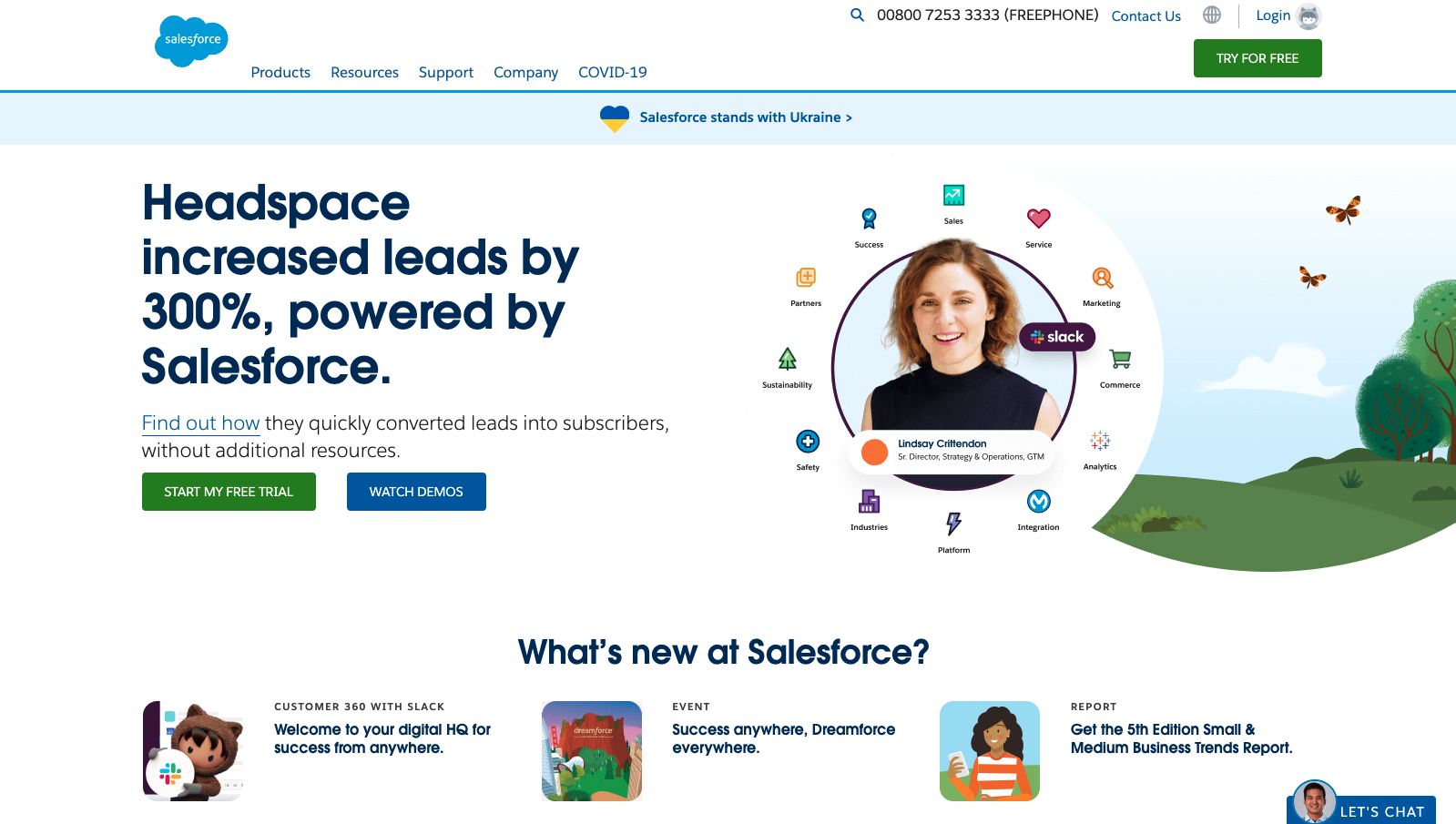
Salesforce
While at first glance, you may think this design is a bit over the top, Salesforce’s landing page can be considered an example to follow.
Throughout the different sections, it provides relevant information that highlights the value of its services and products.
Salesforce explains how they have improved the processes of different companies and organisations. They look to provide a next step that is customised to meet your needs.
That’s why the form is a bit more comprehensive, without being too heavy that said.
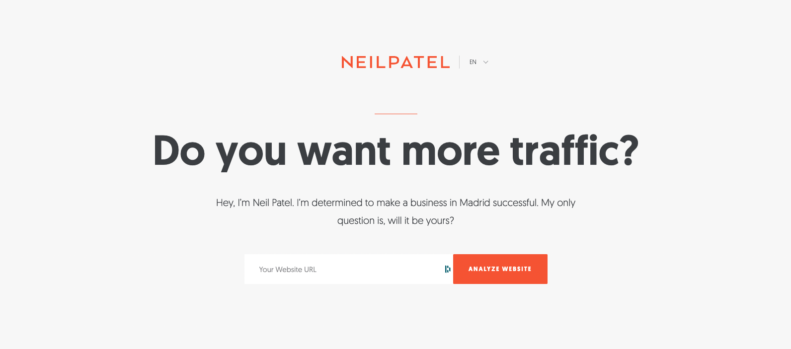
Neil Patel
One of the great masters of digital marketing couldn’t help but have a great example of a landing page.
Simple form, brand and attribute reinforcement, short but impactful content, and most importantly, a clean, attractive, distraction-free design.
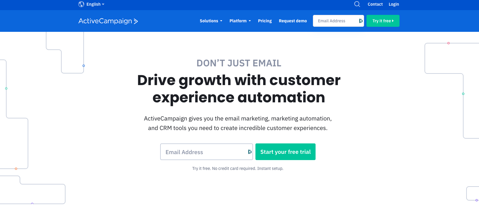
ActiveCampaign
In this landing page example, we see that ActiveCampaign has managed to simplify the design to achieve one goal: to get the visitor to share their email and start a free trial.
The title, large and in the centre of the page, reminds us of the advantage of working with their platform to run successful marketing campaigns.
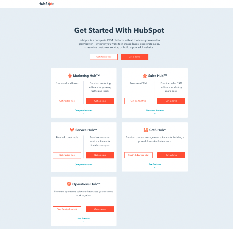
HubSpot
While we see that there are 5 different products on this landing page, the objective and call to action are identical: request a demo.
The design is simple and while it includes some animated elements, they are not distracting. The title is very precise and each sub-product includes a short but detailed description to understand the differences between one and the other.
LinkedIn Jobs
The message is very clear throughout the design: “post jobs with LinkedIn”.
To do this, they dedicate a section to the different reasons why LinkedIn is the best option in the market and another to detail the step-by-step for its proper functioning.
The visual aspect, although it includes much more graphic elements than what we saw in the previous examples, serves a key function: helping the visitor to get a better idea of what the platform is.

Conclusion
Ready to create your next landing page? Read our article about landing page design trends.
That said, remember that there is no one template or design that will guarantee the best results. It will vary depending on the industry you are in, the audience you want to reach and the promotion you are doing.
What you need to make sure is that good practices are in place and that you take care of the details of the wording, design, and operation of the page.
If you need help creating your landing page, we can recommend the best web design agencies.