The Essential Elements of Effective Brochure Design
 5.00/5
Although the world is digitally evolving regularly, a few of the conventional elements remain prevalent. For instance, the humble brochure design remains a potent tool, a tangible expression of your brand’s identity and offerings.
The brochure is not just a piece of paper but a strategic communicator. It still manages to capture attention, convey messages, and inspire actions. In short, a well-crafted brochure is a catalyst for engagement.
But how do you create brochures that make an impact? What elements included in the brochures spark curiosity and beckon actions?
Fret not; all your concerns will be answered in this blog.
Join us as we explore the nuanced elements that transform an ordinary piece of paper into a powerful conduit of communication, leaving a lasting imprint on your audience.
Understanding Your Audience
Identifying Target Demographics
In the process of brochure designing, the foundation lies in recognising your audience.
Begin your project by pinpointing the key demographics your product or service aims to captivate. Since age, gender, geographic location, and socio-economic status all play pivotal roles, conduct thorough research to unveil the preferences. This research will help unveil the behaviours of your potential customers, too.
Besides, demographic insight is the bedrock upon which your design decisions will rest.
Tailoring Design to Audience Preferences
Once the demographic puzzle pieces are in place, the next step is to align your brochure’s design with the specific preferences of your target audience.
Are they drawn to vibrant visuals or prefer a more minimalist approach? Do they resonate with bold typography or lean towards a softer, more elegant font?
Your design choices should harmonise with their tastes. Only then can you create an instant connection that piques their interest.
Considering the Target’s Needs and Interests
Beyond aesthetics, delve into the practical realm of your audience’s needs and interests.
What issues are they facing that your service or product can address? Highlight these solutions prominently in your brochure. Also, incorporate compelling visuals and concise messaging that not only grab attention but also resonate with the practical aspects of their lives.
When you demonstrate how your offering addresses their specific concerns, you establish a rapport that transcends the visual appeal of your brochure.
Clear and Concise Messaging
Defining Key Messages and Objectives
In the production of effective corporate brochures and design, clarity reigns supreme. Hence, begin by crisply defining your key messages and objectives. Also, identify the primary purpose of your corporate brochure first—whether it’s to inform, persuade, or prompt action.
These key messages will serve as the guiding stars. They will shape the narrative and design elements throughout your brochure template.
Crafting Compelling Headlines and Subheadings
Headlines and subheadings act as the beacon. They guide your audience through the informational landscape of your brochure or pamphlet. Hence, craft them with purpose and precision, ensuring they encapsulate the essence of your key marketing messages.
A compelling headline arouses curiosity, inviting further exploration. Similarly, subheadings provide structure, breaking down complex information into easily digestible segments.
Avoiding Information Overload
Less is often more when it comes to conveying information in a brochure.
Fight the temptation to overwhelm your audience with a barrage of details. Instead, curate your content judiciously, presenting only the most crucial information. Embrace white space, allowing the brochure design to breathe and the reader to absorb key messages effortlessly.
Remember, a well-balanced mix of text and visuals creates a harmonious symphony that resonates with your audience.
Visual Hierarchy and Layout

Establishing a Clear Visual Hierarchy
Visual hierarchy is the silent conductor guiding your audience through a symphony of information. Hence, clearly define the primary, secondary, and tertiary elements in your brochure design.
Determine what deserves the spotlight and what plays a supporting role? Accordingly, use size, colour, and placement to orchestrate the hierarchy. This will ensure that your audience’s eyes follow a natural and intuitive path through your brochure.
Organising Content for Easy Readability
An effective layout is not just about what catches the eye but also about how easily the content can be consumed.
Hence, organise information in a logical flow, for it will allow the reader to navigate effortlessly from one section to the next. You can also utilise grids, columns, and strategic spacing to create a balanced structure. Lastly, break down information into digestible chunks. This will foster a sense of clarity and make your brochure a pleasure to read.
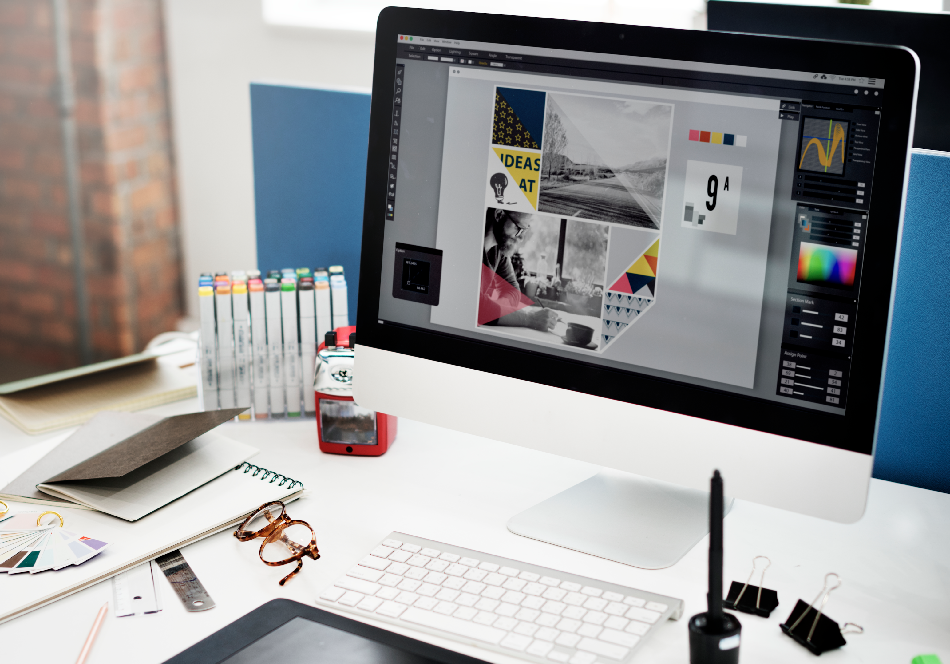
Choosing Appropriate Fonts, Colours, and Imagery
The visual elements you choose are the brushstrokes painting the canvas of your brochure.
So, focus on selecting fonts that align with your brand and are easy to read. Similarly, your chosen colours should be visually appealing and convey the mood and tone of your message.
Imagery should resonate with your audience, complementing the text and enhancing overall understanding. Consistency in these choices strengthens your brand identity and aids in building a visual connection with your clients and readers.
Engaging Imagery and Graphics
Selecting High-Quality, Relevant Images
Imagery is the visual storyteller that captures your audience’s attention.
So, always choose high-quality, relevant stock images that go beyond complementing your message. They should resonate with your target demographic, too.
Yes, we agree that the images should be eye-catching. But they should serve a purpose. Only then can they enhance the narrative and produce a visual language that speaks directly to the emotions of your audience.
Incorporating Graphics to Enhance Visual Appeal
Graphics add a personal touch and spice to your brochure. Hence, thoughtfully incorporate graphics to break up text and create visual interest.
Infographics, icons, and illustrations can simplify complex information, making it more accessible to your audience. Also, remember to strike a harmonious blend of images and graphics. This will help captivate the audience and reinforce the core messages of your brochure.
Ensuring Consistency in Image Style and Tone
A cohesive visual experience is essential for the creation and success of your brochure.
Maintain consistency in image style and tone throughout the design. Whether it’s the colour palette, image filters, or the overall visual theme, a unified approach strengthens your brand identity.
In short, consistency fosters trust and familiarity. It guides your audience through a seamless visual journey.
Branding Consistency
Incorporating Brand Elements (Logo, Colors, Fonts)
Your brochure is not just a standalone piece; it’s an extension of your business and brand.
Hence, incorporate brand elements such as the logo, colours, and fonts to reinforce your brand identity. The logo serves as a beacon, instantly connecting your audience to your brand. Consistent use of brand colours and fonts enhances recognition, creating a cohesive visual language that aligns with your overall brand strategy.
Maintaining a Consistent Brand Voice
Beyond visuals, your brand voice is the echo that resonates in the minds of your audience. So, ensure a consistent brand voice throughout the brochure. Whether your brand exudes professionalism, friendliness, or innovation, let that voice echo through your messaging. Consistency in tone builds trust and familiarity, fostering a stronger connection with your audience.
Reinforcing Brand Identity Throughout the Brochure
Your brochure is a brand ambassador, and every page of the custom brochure should reflect your brand identity.
From the cover to the back page, maintain a consistent visual and tonal language. Reinforce your brand identity through every element. This way, you can ensure that your audience not only remembers your message but also associates it with the essence of your brand.
Call to Action (CTA)
Crafting a Compelling CTA
The pinnacle of effective brochure design is the Call to Action (CTA) – the beacon that guides your audience towards the desired outcome.
Hence, craft a compelling CTA that resonates with your key messages. Whether it’s urging them to make a purchase, visit your website, or contact you for more information, the language should be persuasive and imbued with a sense of urgency.
Placing the CTA Strategically Within the Brochure
Strategic placement of your CTA is crucial for its effectiveness.
Consider the natural flow of your brochure and position the CTA where it makes the most impact. Whether at the end for a final push or strategically peppered throughout, the goal is to integrate it into the reader’s journey seamlessly. This will help prompt a response without disrupting the overall reading experience.
Encouraging a Specific Response from the Audience
A compelling CTA should not leave room for ambiguity. Clearly articulate the specific action you want your audience to take. Whether it’s making a purchase, filling out a form, or contacting your team, guide them towards a tangible response.
The more explicit and tailored your CTA, the higher the likelihood of a positive and measurable outcome.
Paper and Printing Considerations
Choosing the Right Paper Type and Size
The physical manifestation of your brochure is as important as its design. So, choose the right paper type and size that aligns with your brand and purpose.
Consider the tactile experience you want to evoke – whether it’s a luxurious feel, a sturdy impression, or a lightweight, eco-friendly touch. The size should be practical, ensuring easy handling and storage while still maximising visual impact.
Considering Printing Techniques (e.g., Matte, Glossy)
Printing techniques contribute significantly to the visual appeal of your brochure.
So spend time deciding on the finish that best complements your design and brand identity. Matte finishes convey sophistication and subdued elegance, while glossy finishes exude vibrancy and enhance colour saturation.
The choice of printing technique is a nuanced decision that adds an extra layer of finesse to your overall design.
Ensuring High-Quality Printing for a Professional Finish
No matter how impeccable your design is, the final execution relies on high-quality printing.
Partner with a professional printing service to ensure colour accuracy, sharpness, and durability. A professionally printed brochure not only enhances the visual impact but also communicates a commitment to quality, reflecting positively on your brand.
Testing and Feedback
Conducting Usability Testing with the Target Audience
Before your brochure goes to print, subject it to the scrutiny of your target audience. Conduct usability testing to gauge their experience.
Are they navigating through the content effortlessly? Is the messaging clear, and does the design resonate?
Use this feedback to iron out any potential wrinkles and ensure your brochure aligns seamlessly with the expectations of your audience.
Seeking Feedback from Stakeholders and Design Professionals
Expand your feedback loop beyond the audience by seeking insights from stakeholders and design professionals. Their perspectives can provide valuable insights into alignment with brand strategy, market trends, and design principles. Consider their input as a final check before committing to print. This way, you can ensure that your brochure is a polished reflection of your brand.
Iterating and Refining the Design Based on Feedback
Feedback is not just a formality; it’s a catalyst for refinement. Take the feedback received and iterate on your design. Fine-tune elements that need adjustment and strengthen areas that resonated positively. Also, ensure that your final product is a testament to the collaborative effort of your team and the valuable input from your audience and stakeholders.
Distribution and Accessibility
Choosing Appropriate Distribution Channels
The effectiveness of your brochure hinges not only on its design but also on how well it reaches your audience.
Choose distribution channels that are in sync with your target demographic. Whether it’s direct mail, in-store distribution, or trade shows, tailor your approach to maximise visibility.
Consider the habits and preferences of your audience, ensuring your brochure lands where it’s most likely to be seen.
Ensuring Accessibility for Diverse Audiences
Ensure your brochure is designed with inclusivity in mind. Opt for font styles and sizes that are easy to read for all age groups. Use colour contrasts that accommodate those with visual impairments.
When you make your brochure accessible to a broad spectrum of individuals, you not only broaden your reach but also showcase a commitment to inclusivity.
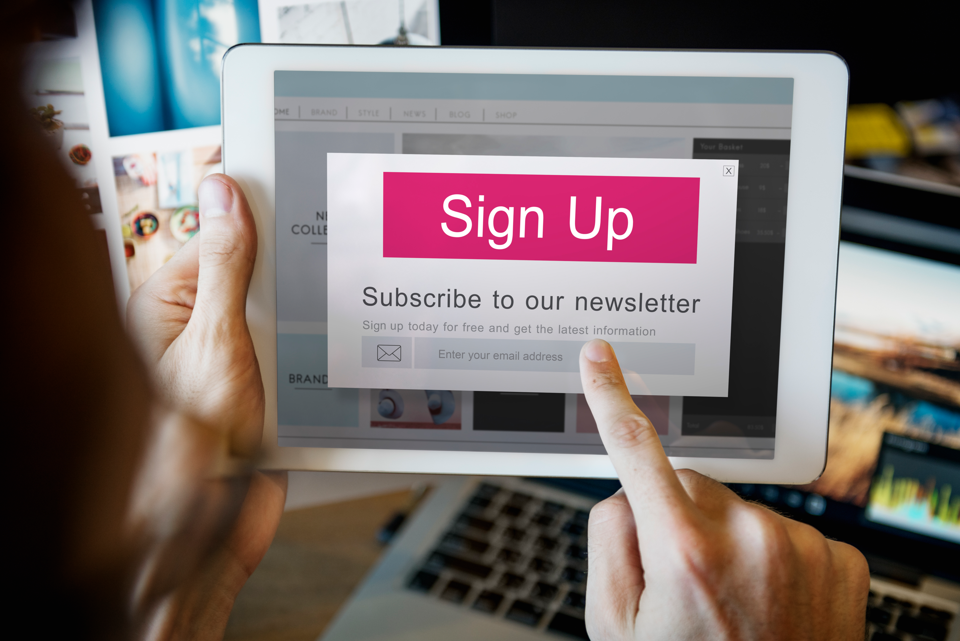
Considering Digital Formats for Online Distribution
Convert your brochure design into digital formats such as PDFs or interactive online brochures. This will not only widen your audience but also provide an avenue for seamless sharing through digital mediums, including mail and social media.
Embracing the digital medium ensures your brochure is not confined to physical boundaries.
Budget Considerations
Estimating Costs for Design and Printing
Estimate costs for both design and printing services. Consider factors such as the complexity of your design, the quality of materials, and the quantity of brochures needed.
A thorough cost estimate allows you to allocate resources judiciously. This way, you can stay assured that every dollar spent contributes to the overall effectiveness of your brochure.
Exploring Cost-Effective Design Alternatives
Remember, designing a brochure doesn’t have to be a costly affair.
You can always explore cost-effective design alternatives that align with your financial parameters. This could involve simplifying certain design elements or opting for standardised printing sizes. You can even leverage digital platforms for cost-efficient distribution.
Strategic choices can maximise your budget without compromising the visual appeal and effectiveness of your brochure.
Balancing Budget Constraints with Design Quality
Prioritise design elements that have the most significant impact on your audience while identifying areas where cost-saving measures can be implemented without sacrificing overall quality.
The key is to create a balance that aligns with your goals and financial parameters.
Are you looking for |
Discover the most relevant agencies for your project based on your own specific requirements.
Find an agency!Final thoughts
Remember, a brochure is not merely ink on paper; it’s a narrative, a call to action. Hence, it is crucial that you understand your audience, place CTA strategically and adhere to all the details listed above to ensure your brochure sparks curiosity and beckons actions.
Also, as you apply these principles, remember the journey doesn’t end – continuous evaluation and adaptation ensure your brochure remains relevant and resonant with evolving audience needs.
To further elevate your design journey, work with platforms like Sortlist to get connected with skilled professionals who understand the dynamic interplay of design elements!